But I digress.
I think calling the Shiller CAPE "useless" is, in and of itself.. "useless". While I do agree that it should not be used as a model to TIME an investment in the stock market.. I do think the information provides a ton of useful and interesting information about the stock market.
I have spent many years looking at the data from a variety of different angles to see what sort of information and understanding I could glean from the good Doctor's research. The following post details one of the more interesting findings I've come across over the years - and while it might be 'irrelevant' to high frequency traders and algos whose investment time horizons are measures in "nanos" and "picos", it should be of interest to any retail portfolio manager or broker who runs money for individual clients to finance their retirements.
What did I do? I looked at the Shiller data (link here: note, this will open an Excel Spreadsheet) and then calculated the 5, 10, 12, 1 and 20 (per) year returns based on a starting CAPE level. The returns that I found do NOT include reinvested dividends, but it at least gives you an idea of what sort of return one "should expect" for the next few years.
The results came in as one would expect - if you pay a higher CAPE for a stock.. your following year's returns are significantly lower than if you buy at a lower CAPE.
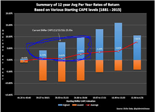
Here is a graph for the 12 year averages..
So, if you buy the S&P 500 at a CAPE of 40.40x to 44.20x, you should expect to earn an average return of -0.41% a year for the next 12 years.. alternatively, if you buy with a CAPE between 4.87x and 12.96x, your average return per year jumps to a very healthy 7.81%.. Nice!
I won't bore you with all of the data (the entire 5-20 year spectrum) as that's not what I really want to discuss in this post.. but here is the 10 year just for laughs..
This process is all well and good and provided a result that wasn't, nor shouldn't have been a shock. We as investment professionals spend our entire careers trying to identify "attractively priced' companies to buy on behalf of our clients. Indeed, if you are a regular reader of this blog (that's a joke - as no one reads this thing - but that's okay.. I write more for me.. not anyone else..) then you know equity valuation is a sort of a big thing in my book - and why my favorite quote about investing is:
"Never overpay for a stock. More money is lost than in any other way by projecting above-average growth and paying an extra multiple for it."
Charles Neuhauser (Bear Stearns)
Yes - I've mentioned this quote a few times - here and here but the frequency of my mentioning it simply highlights the importance of Neuhauser's advice: Don't overpay.. ever!
Now.. here is where it gets super interesting....
Last week I finally got a chance to watch Jim Bruce's amazing documentary "Money for Nothing - Inside The Federal Reserve". (If you haven't seen this movie.. do yourself a favor and watch it.. I'd say it's a "MUST".)
One part that really stood out for me was the concrete view that the Fed seems to be fully engaged in blowing bubbles to recover from past bubbles. So, after I watched the movie.. I went back to my CAPE spreadsheets - and sure enough.. there it is. Evidence of another Fed induced bubble.
What am I talking about? Well - go back to that 12 year CAGR chart above.. this time I was looking at WHEN the upside bounces on those returns from starting CAPES of 44.20 down to 20x happened.. (circled here for you in angry blue....)
Why angry blue? Well.. check out the dates that are associated with he highest rates of return earned over a 12 year period..
the top 68 HIGHEST 12 year rates of return have been earned at some point between 2001 and 2015..
It follows then that the Fed's blowing of a SECOND bubble after the dot com bust has greatly skewed the 12 year average rates of return - and that absent a Fed induced bubble (if things were allowed to sort themselves out naturally.. like they did from 1881-2000) the rates of return would have been substantially lower.
the other thing that I think contributed towards the jump in valuations was acceptance of "forward earnings". I seem to recall that when I first started in the business, research reports and commentary centered around "trailing" earnings.. that is, earnings that had already been reported. Gradually 1 year forward eps estimates crept into the finance vernacular. First, along side the trailing - so you'd see something like:
XYZ is trading at 10x trailing earnings, and only 6x next year's.
then the street went super cheeky and started talking about 2 year forward earnings..
So now you can imagine what good old Mr. Neuhauser would say if he saw that we were paying 18x two year forward expected earnings on a company whose growing at 4% a year..
he'd probably yell a lot and then get a nosebleed..
So yes, the CAPE isn't a useful tool for telling you when to get in or out of a stock.. but, I think it IS a valuable tool for giving you an idea of what sorts of returns one should expect given a certain starting level on the CAPE...
interesting stuff!
Gubb


